Monday, 31 October 2011

Q5 Evaluation

Q4 Evaluation

Q4 Evaluation
by: karleabaker


This below is an example of the type of music the audience of my magazine would listen to.

Sunday, 30 October 2011

Saturday, 29 October 2011

q2 Evaluation

Q1 Evaluation

Q1 evaluation
by: karleasb


Audience Feedback Written ( sound and video )


 *


Q1. How old are you?
The ages of the people who filled out my questionnaire were from the ages of 12 - 24+. the average age was 16 years.


Q3. Which music magazine do you read?
The average answers were: None, Kerrang, Q and NME.
The most popular magazine out of the 3 was NME, With Kerrang and Q both having 2 readers.


Q5. Would you read this magazine and why? 
The average answer was yes because people where interested in the cover stories, images, colour scheme, they also thought it looked interested and eye catching. However one person said they wouldn't but because it is not their personal choice of magazine to read however they agreed that the cost is reasonable and the layout and font are good. 


Q6. What things do you like about my magazine?
They where given a choice of 5 things, cover stories, images, font, colour scheme And the price. The most popular choices were: Images and cover stories. The least popular was Font. 


Q8. What would you improve about my magazine?
The average answers were; nothing, more cover lines and to make the main image on front cover bigger. 


Q9. Who do you think my magazine appeals to?
The main answers were 16-25 year olds and Rock music fans. However one person who was above the age of 24 answered it was targeted at under 16's you could argue that this is because she does not know that it would be targeted at a certain age group because she is above that gap. 


Q10. What do you think about the images ...?
Front cover : Audience answered a varied selection of answers including; eye catching, direct address is good, the image is theatrical, it fits the genre of the magazine and it stands out.


Contents page: The audience said they were clear, good shots and creative clear images and that they too like the front cover also fit the genre.


DPS: They said  that it was a good live shot and it is very eye catching when looking briefly at the magazine.


Q13. What do you think of the layout of my magazine?
The options for this question were; neat and readable or messy and also there was space for the audience to write what they thought of it. However all answered that the magazine was neat and readable.


Q14. How could the layout be improved on the contents page?
The main answers were quality of images, re arrange the images and also to re arrange the writing. 


Q17. what target audience do you think the contents page appeals to ?
The main answers to this question were young people that are interested in bands, and also young boys and girls who are interested in rock music.


Q18. What target audience do you think the DPS appeals to?
People thought this would appeal widely to Avril Lavigne fans ( this includes whatever age ) and also rock music lovers but also people who are interested in Gig reviews.

Audience Feedback Graphs

Friday, 28 October 2011

Production of Double page spread

For this I decided to type all my text out into the columns and then drag them so they where arranged neatly. Quark was hard to make the text move onto the next column because there were a few steps to do so and it had to make sure that the text was still in the guidelines. I also added a caption to the image describing it. The title was on the top of the left and included the same colour as the colour of the girl on the images top. To edit the title I had to edit the width between the letters and I also edited the space between each line of text. It was quite easy to edit this because it was simply clicking buttons at the bottom of the page. However It was a lot of concentration trying to get them all to the same widths etc.
The stand first is above the text so the audience would read it before reading the actual article.

I then decided to move the caption down to the bottom where there was less text and so that it didnt look like too much writing next to the title of the article. the by line is also at the bottom right. The standfirst was edited by removing and changing certain words so that it was not too much to read. To edit the standfirst on quark I had to make sure I did not write too much as it would go over the guidelines and then I would have to edit the text which would then need to be edited further so it would fit into the columns.

I then decided to add a black background behind the title so that it stood out  against the picture. To add the black box it was very straight forward as I just had to make a shape box and make the background black. However getting it to the right size was hard because I had to make sure it did not cover the image. The layout of the text has also been changed so that some letters are closer together than others. Also 'lights up' has been changed to yellow instead of just 'the apollo'. I have also included a drop quote in the middle of the article and changed the drop capital so that it was professional and not just a big letter. To include the drop quote I had to shorten the actual text so that there would be space to do so. To add the drop capital was easy because it was just the tick of a button.

I have split my text into paragraphs so that it wasn't too much text to read in one go. And also indented the paragraphs.Indenting the paragraphs was hard on quark because you had to highlight all text and specifically do it each paragaph seperately. I decided to get rid of the photo caption because it was not needed. The photo was bled onto the start of the page with text on so that it didn't look as straight and block like.I have removed some of the text that is not needed and also included the by line in the stand first.
I decided to make the text more left aligned than centre. I also had added more text and made the sure the texts ended in all the same places. Text has also been made smaller. Quark was hard to do such small changes such as the text boxes moving on the the next column was difficult because it would change the spaces of the text and words would not look the same when they went onto the next line. 


This is my final version of my DPS. On the past DPS The black box underneath the title was on top of the photograph and as the photo was not in the right position the black box started to cover the images head. So I decided to move the title off of the photograph completely and have one page specifically for the photograph also removing the photo caption but making sure it was still bled onto the other page. The black box then went onto the next page with the title on the top of it above the standfirst. I also included the by line in the standfirst. I had to move the text down and as it all did not fit anymore some of the text had to be removed and the article had to be shortened. The drop quote was also removed. 


Thursday, 27 October 2011

Production of contents page

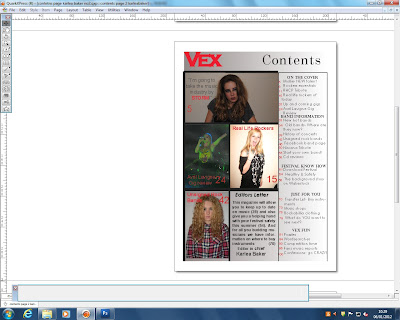
For My contents page I split it into 3 sections with two of the columns that where going to be for images and the last third column for the text. The title and slogan where placed in the top left hand cornor just like on the front cover and contents title was above all the text. However after a few lessons i decided to remove the standfirst and just keep the title Vex and also I had to change the font because it wasn't 'Rock' enough. I Also decided to change the distance between the letters of the Title and the contents title. The font for 'On the cover' etc also had to be changed as they where not rock enough either. I also did not like the black bold lines, that i used the shape tool to do, around the word so I removed them.

After typing up all the text in the right hand column I then had to add pictures and change colours. I started with changing the colour of the background and I didnt want a block colour so I used a gradient grey colour which is a colour from my colour scheme that is not used as much as the others. On Quark it was quite simple to change the background first you had to make a new layer and put it behind the other layers before changing the effect and colour. I had to do this by creating a new layer and choosing a colour and then editing it to gradient and make sure I placed it behind all text and images. After doing this I decided to add the images which I then had to fit to a picture box in the space of the two columns. I then remembered that I wanted to include and editors letter so i had to leave a space to write that out which I decided looked best in the bottom right next to the column of text. I also changed the size of the cover story group titles and the size so that they could all fit.
Next thing to do was add the page numbers so I typed each numbers in by creating a text box for each and placing them next to the correct story. This took a lot of time as they had to be very straight and not wonky. I decided to keep the words on the right black and make the page number red as the red would stand out more when they where searching for it. At first I had the text centered but i then changed to having it left alligned. The captions on the images on the left are all in red as some of the pictures are quite dark the black would not have shown up over them. I then decided that to make the contents look more intriguing I added black bold lines around the edges. I did this by using the shape tool like I had to put the lines around my contents story group titles. However they went over the edges slightly so I had to touch it up and erase the wrong bits out.

I then decided to finish off the bold black lines. Some had a width of 6pt and others 8pt depending on where about they where placedo on the page. To do these black lines I used the line tool and edited it with the tool box at the bottom of the screen. I also re arranged the numbers next to the pages.  


This is the finished contents page. As the contents page looked bland as the background colour was grey I decided that it needed to be a bit brighter but I did not want to change the background colour because then that would mean changing it to red and there fore I would of had to change all other text that was already red. I then proceeded to create a banner to go under the text titles on the right hand side. I made these by using the rectangle picture box tool and simply then making it a block colour of red. However I didnt want all 5 to be the same size and shape, I wanted each to be unique to the text it was under so I made some slightly thinner or even smaller in width. Also the banners did not reach both sides of the column there was a small gap between. I then made sure that the text was in the middle of the banner and wasn't too big for the banner itself.
There is a minor edit on this and it is on the last title. 'Vex Fun' was not in the correct place and I alligned it slightly more to the centre by simply creating a space before it in the text box. I then edited the size of the red banner. Quark made it hard for me to position text and lines in the correct places I wanted because it would not move them to the right place it would either move them too far or too little of a distance from where it already was.


For this I decided to edit the size and width of the banners because when they where all odd sizes it looked messy and unprofessional. I resized with ctrl+T so they where all a similar size but some couldn't be bigger as they would go over text.

I decided to remove the editors letter and also a picture so that i could re edit it. I then removed the picture in the bottom left.


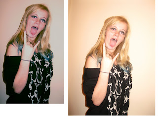
The picture on the right is the original photo. I decided to edit it because it was too bright and the colour did not blend in well with my contents page so I uploaded the picture to photoshop and edited the colour variations and enhanced a blue colour so the 'yellowness' would be removed.


I removed all stories that where not clear and precise enough. I then rearranged the remaining stories and the page numbers.

The last column of strories was called vex fun, however after removing the wordsearches and puzzles I decided to rename it to vex extras and then continue on the adding more cover stories.


I then added new stories and more page numbers too. However I still didnt think it looked professional enough.

After not being happy with the layout I decided to re arrange it so it was along the bottom and then i could there fore add more stories and help the contents to be more full. I then also added a subscription to my magazine with a small graphic banner next to an image of my magazine.
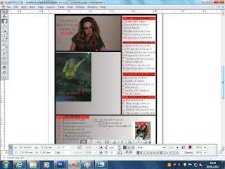
I decided to remove the box for subscriptions as it was just a box that was filling up any unnecessary space.


I then re added the photo graphs and an extra one that was a landscape picture.  For the picture to be so thin and small I had to edit the original photograph on photo shop so that it would fit in the picture box on quark. 

I then decided to remove the banner from the bottom and keep it on the right hand side in one orderly column, This meant that I had to re remove the subscriptions and photo of magazine and then remove the slim landscape photograph. The photo graph that then filled the space was the original large photograph that had not been edited in any way on photoshop. It fitted into the picture box on Quark.


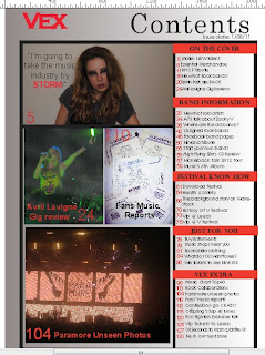
This is my final contents page. For this I then made sure all the banners on the story sections were even and all went from one side to the other overlapping the black outlines. After doing this I then made the out side picture box for the bottom photo bigger so that the photo would be bigger and not have uneven gap around the photograph.

I made the photographs bigger so there was no grey gaps where the background could be seen. I then made sure that the black lines around the photographs where consistant so that there was no odd photographs.

Wednesday, 26 October 2011

Production of front cover

For this I was using photoshop. I used a lot of graphic shapes and had to use shape tool  to draw out the shape before I used a text box over it so it would be written inside the shape. I then changed the thickness of the lines.


I had decided to change my font as green did not really suit the genre 'rock'. In the bottom right I  tested what the magazine would look like with a photograph I had taken.

I used two more examples and decided on the last one, I then had to edit he colour of a text box as it stood out too much and did not match the magazine colour scheme.

In this I had finally decided on my photo graph main image. However I had decided to change the cover stories so that they where all on the right hand side and not covering the main image's hair, I was then going to place the main cover story in the middle over the person in the image.


All text is on the Right hand side and the main story is centered in the largest font so it stands out.


I decided to move the main cover story to the bottom left so that the text was more readable as the colour is white.


I decided to change the font because it wasn't rock enough. I also added lines between each cover story and changed the width so it was around 8pt. Then I made the main cover story bigger than all the other text so that it would stand out and people would know which was the main story. I also changed the place of the square text box and moved it to the left as that was slightly bare. Then I felt I had to add more graphics so added a circle in the bottom right next to the rest of the stories.


This is the final cover. I made the positioning statement smaller and the issue no smaller also. I changed a few cover stories so they were less vague and more intriguing. The word 'Mollie' i moved close together using the AV tool. I decided to make my masthead fit more across the page so I increased the font size.


changed the space of price because it looked odd in the right hand cornor it took the attention away from the masthead. Now it follows codes and conventions and is in the bottom right hand cornor next to the barcode.


Tuesday, 25 October 2011

All photographs taken


This picture was not suitable because her expression is not angry enough .

This photo could be potential if it was zoomed in however the only bad thing is that there is no direct address with the readers.


This was the final chosen image for the front cover. Her face is very questioning and connotes attitude and so does her lifting her rim of her top up as it has another solo artist on the t-shirt. There is also very strong direct address.