|
| For My contents page I split it into 3 sections with two of the columns that where going to be for images and the last third column for the text. The title and slogan where placed in the top left hand cornor just like on the front cover and contents title was above all the text. However after a few lessons i decided to remove the standfirst and just keep the title Vex and also I had to change the font because it wasn't 'Rock' enough. I Also decided to change the distance between the letters of the Title and the contents title. The font for 'On the cover' etc also had to be changed as they where not rock enough either. I also did not like the black bold lines, that i used the shape tool to do, around the word so I removed them. |
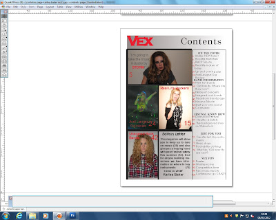 |
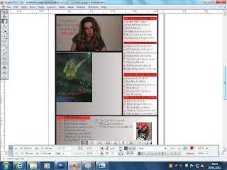
After typing up all the text in the right hand column I then had to add pictures and change colours. I started with changing the colour of the background and I didnt want a block colour so I used a gradient grey colour which is a colour from my colour scheme that is not used as much as the others. On Quark it was quite simple to change the background first you had to make a new layer and put it behind the other layers before changing the effect and colour. I had to do this by creating a new layer and choosing a colour and then editing it to gradient and make sure I placed it behind all text and images. After doing this I decided to add the images which I then had to fit to a picture box in the space of the two columns. I then remembered that I wanted to include and editors letter so i had to leave a space to write that out which I decided looked best in the bottom right next to the column of text. I also changed the size of the cover story group titles and the size so that they could all fit.
Next thing to do was add the page numbers so I typed each numbers in by creating a text box for each and placing them next to the correct story. This took a lot of time as they had to be very straight and not wonky. I decided to keep the words on the right black and make the page number red as the red would stand out more when they where searching for it. At first I had the text centered but i then changed to having it left alligned. The captions on the images on the left are all in red as some of the pictures are quite dark the black would not have shown up over them. I then decided that to make the contents look more intriguing I added black bold lines around the edges. I did this by using the shape tool like I had to put the lines around my contents story group titles. However they went over the edges slightly so I had to touch it up and erase the wrong bits out. |
 |
| I then decided to finish off the bold black lines. Some had a width of 6pt and others 8pt depending on where about they where placedo on the page. To do these black lines I used the line tool and edited it with the tool box at the bottom of the screen. I also re arranged the numbers next to the pages. |
|
|
This is the finished contents page. As the contents page looked bland as the background colour was grey I decided that it needed to be a bit brighter but I did not want to change the background colour because then that would mean changing it to red and there fore I would of had to change all other text that was already red. I then proceeded to create a banner to go under the text titles on the right hand side. I made these by using the rectangle picture box tool and simply then making it a block colour of red. However I didnt want all 5 to be the same size and shape, I wanted each to be unique to the text it was under so I made some slightly thinner or even smaller in width. Also the banners did not reach both sides of the column there was a small gap between. I then made sure that the text was in the middle of the banner and wasn't too big for the banner itself.
|
|
|
There is a minor edit on this and it is on the last title. 'Vex Fun' was not in the correct place and I alligned it slightly more to the centre by simply creating a space before it in the text box. I then edited the size of the red banner. Quark made it hard for me to position text and lines in the correct places I wanted because it would not move them to the right place it would either move them too far or too little of a distance from where it already was.
For this I decided to edit the size and width of the banners because when they where all odd sizes it looked messy and unprofessional. I resized with ctrl+T so they where all a similar size but some couldn't be bigger as they would go over text.
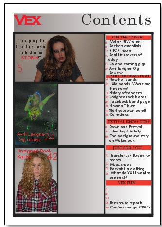
I decided to remove the editors letter and also a picture so that i could re edit it. I then removed the picture in the bottom left.
|
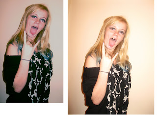
The picture on the right is the original photo. I decided to edit it because it was too bright and the colour did not blend in well with my contents page so I uploaded the picture to photoshop and edited the colour variations and enhanced a blue colour so the 'yellowness' would be removed.
I removed all stories that where not clear and precise enough. I then rearranged the remaining stories and the page numbers.
The last column of strories was called vex fun, however after removing the wordsearches and puzzles I decided to rename it to vex extras and then continue on the adding more cover stories.
I then added new stories and more page numbers too. However I still didnt think it looked professional enough.
After not being happy with the layout I decided to re arrange it so it was along the bottom and then i could there fore add more stories and help the contents to be more full. I then also added a subscription to my magazine with a small graphic banner next to an image of my magazine.
 |
| I decided to remove the box for subscriptions as it was just a box that was filling up any unnecessary space. |
 |
| I then re added the photo graphs and an extra one that was a landscape picture. For the picture to be so thin and small I had to edit the original photograph on photo shop so that it would fit in the picture box on quark. |
 |
| I then decided to remove the banner from the bottom and keep it on the right hand side in one orderly column, This meant that I had to re remove the subscriptions and photo of magazine and then remove the slim landscape photograph. The photo graph that then filled the space was the original large photograph that had not been edited in any way on photoshop. It fitted into the picture box on Quark. |
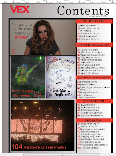 |
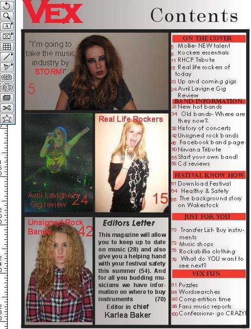
This is my final contents page. For this I then made sure all the banners on the story sections were even and all went from one side to the other overlapping the black outlines. After doing this I then made the out side picture box for the bottom photo bigger so that the photo would be bigger and not have uneven gap around the photograph.
I made the photographs bigger so there was no grey gaps where the background could be seen. I then made sure that the black lines around the photographs where consistant so that there was no odd photographs. |